centiNels
centiNels.RmdFoolish percent differences
On 1 April, 2020, a Canadian dollar (CAD) cost 0.703 US dollar (USD). The Canadian dollar gained strength pretty steadily for the next year, and by 1 July it would cost 0.736 USD, by 1 October, 0.753 USD, by 4 January 2021, 0.782 USD, and by April fools day 2021, 0.796 USD. How much is the exchange rate changing?
Often, such changes are described in terms of percent difference, even though this doesn’t always make sense. Below is a brief peek at the insanity of percentage differences: any change in the exchange rate will be reflected as different percentage changes, depending on which direction you’re hoping to exchange currency.
exch %>%
  filter(date %in% as.Date(c("2020-04-01"
                     , "2020-07-01"
                     , "2020-10-01"
                     , "2021-01-04"
                     , "2021-04-01"))) %>%
  mutate(pct_diff = round(100*(exRate_scale-1), 2)) %>%
  select(date, direction, exRate, pct_diff) %>%
  pivot_wider(id_cols = c("date")
              , names_from = "direction"
              , values_from = c("exRate", "pct_diff")
              , names_vary = "slowest"
              )
#> # A tibble: 5 × 5
#>   date       exRate_CADtoUSD pct_diff_CADtoUSD exRate_USDtoCAD pct_diff_USDtoCAD
#>   <date>               <dbl>             <dbl>           <dbl>             <dbl>
#> 1 2020-04-01            1.42              0              0.703              0
#> 2 2020-07-01            1.36             -4.52           0.736              4.74
#> 3 2020-10-01            1.33             -6.56           0.753              7.02
#> 4 2021-01-04            1.28            -10.1            0.782             11.3
#> 5 2021-04-01            1.26            -11.6            0.796             13.2
If Jonathan traded 100 CAD with Michael for 70.31 USD on 1 April 2020, doubtless he’d feel the fool come 1 April, 2021, when Michael would only give him CAD back. He lost just over 10% of his original 100 CAD!
But would Michael, had he declined the trade in 2020, only to accept in 2021, feel even more foolish? He would have gotten 100 CAD for only 70.31 USD in 2020, but now the trade cost him 78.24 USD. In this world, Michael paid over 11% (almost $8 USD) more in 2021 than he would have a year before… also a bad deal.
But wait? Surely Michael declining the trade must be exactly as bad for him as Jonathan’s trade was good for Jonathan? And it would have been! Michael would have given Jonathan 7.93 USD more in 2021 than in 2020 for the same 100 CAD… since he would have ultimately given Jonathan 78.24 USD, this is a loss (in 2021 dollars) of , i.e. the same 10.1% loss Jonathan would have experienced.
Woof. This is confusing! We can make the math work out… but we could also use a better-behaved scale… like the natural log scale.
Logarithmic scaling: Nels instead
Logarithmic transformation is an excellent solution* to this problem. It makes all ratio-based changes linear.
* Familiarity and comfort with logarithms can be major drawbacks; we refer users to the “divMult” vignette for further discussion and some good workarounds
A first step to making the math work is rescaling the data by taking
the natural logarithm. This is hardly a new idea. One idea explored in
ratioScales is that we can simply use natural logarithm
units as our measure of change. Once log-transformed, changes
in exchange rate in one direction will be mirrored by changes in
exchange rate in the other direction of the exact same
magnitude. ratioScales is all about plotting that
retains this symmetry, and in this vignette, we illustrate simply using
a “base e” fold change (one “nel”) as the plotting unit. This can be a
sensible alternative to the common practice of, after a logarithmic
transformation, back-transforming data onto the original scale for
plotting. ggplot2 users will likely be familiar with
the functions scale_*_log10(), which do that.
Perhaps now, the idiomatic way to plot the currency data in ggplot2 is to use the raw exchange rates (we’ll say, scaled to the starting value so we can watch relative change), transform the y-axis by taking the base-10 logarithm, but mark the axes by exponentiating back to the original exchange rate scale.
Here is an example of the exchange rates on the original and base-10 logarithmic scales:
# first, without logarithmic rescaling
exch %>%
  ggplot(aes(date, exRate_scale, color = direction)) +
  geom_hline(yintercept = 1, width = 0.2 ) +
  geom_point() +
  geom_point(
    data = exch %>%
      filter(date %in% as.Date(c("2020-04-01"
                                 , "2020-07-01"
                                 , "2020-10-01"
                                 , "2021-01-04"
                                 , "2021-04-01")))
    , size = 5
    , shape = 23
    , color = "black"
    , fill = "red") +
  scale_color_manual(values = hcl.colors(4, "Plasma")[c(1,2)]) +
  labs(y = "change in exchange rate", main = "orignal scale")  +
  scale_y_continuous(n.breaks = 7)
#> Warning in geom_hline(yintercept = 1, width = 0.2): Ignoring unknown
#> parameters: `width`
#> Warning: Removed 46 rows containing missing values or values outside the scale range
#> (`geom_point()`).

# second, with log10 transformation of y-axis

exch %>%
  ggplot(aes(date, exRate_scale, color = direction)) +
  geom_hline(yintercept = 1, width = 0.2 ) +
  geom_point() +
  geom_point(
    data = exch %>%
      filter(date %in% as.Date(c("2020-04-01"
                                 , "2020-07-01"
                                 , "2020-10-01"
                                 , "2021-01-04"
                                 , "2021-04-01")))
    , size = 5
    , shape = 23
    , fill = "red"
    , color = "black") +
  scale_color_manual(values = hcl.colors(4, "Plasma")[c(1,2)]) +
  labs(y = "change in exchange rate", main = "logarithmic scale") +
  scale_y_log10(n.breaks = 7)
#> Warning in geom_hline(yintercept = 1, width = 0.2): Ignoring unknown parameters: `width`
#> Removed 46 rows containing missing values or values outside the scale range
#> (`geom_point()`).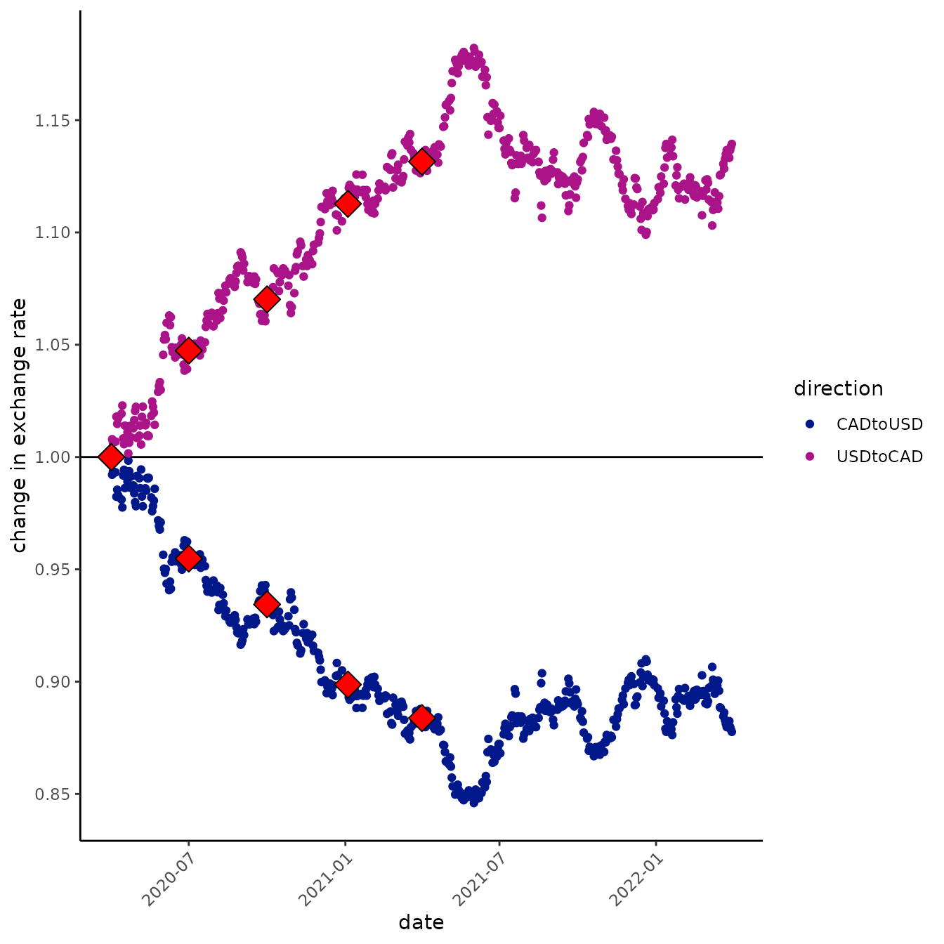
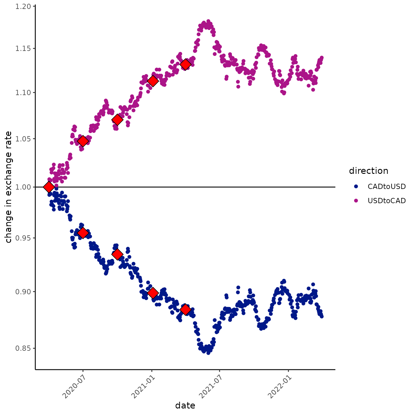
The difference between these two graphs is pretty subtle. If you look closely, you’ll see the distance between 0.85 and 0.9 is substantially greater than the distance between 1.10 and 1.15 on the logarithmic y-axis graph (second), whereas, of course, they are the same distance apart on the arithmetic y-axis (first graph). This gives us a feel for the fact that a decrease of, say, 5% is a bigger change than an increase of 5%, but it’s still hard to see what is consistent between the two directions of exchange (which above, we said was one reason to prefer the log-transformations!).
An alternative is to view data on a logarithmic scale. Lots of bases
can make sense for logarithms (e.g., 2, 10, or e); here we explore
natural logarithms (base e = exp(1)). To do this, let’s
indulge some nomenclature fun, then see what it can do for us.
First, let’s get the most basic unit here… what do we call 1 natural log unit? One Natural Log unit is “one nel” (one NL; one “nel”). How big is one nel? Actually, kind of big: a fold change of over 2.5, so an increase of one nel is over 2.5x.
There’s a nice solution to this: use 1/100th of a Nel as the unit,
one “centiNel.” Just as we might use a percent rather than proportional
difference, or a centimeter rather than a meter, it will often be
convenient to use centinels to track modest changes… actually, just as
the “Bel” is hardly used to measure differences in amplitude (decibels
are used instead), we suspect that “centinels” may be more useful than
“nels” in most cases. Furthermore, in this vignette we explore some
intriguing numerical properties of the centinel.
But first, let’s plot with centinels!
exch %>%
  ggplot(aes(date, exRate_scale, color = direction)) +
  geom_hline(yintercept = 1, width = 0.2 ) +
  geom_point() +
  geom_point(
    data = exch %>%
      filter(date %in% as.Date(c("2020-04-01"
                                 , "2020-07-01"
                                 , "2020-10-01"
                                 , "2021-01-04"
                                 , "2021-04-01")))
    , size = 5
    , shape = 23
    , fill = "red"
    , color = "black") +
  scale_color_manual(values = hcl.colors(4, "Plasma")[c(1,2)]) +
  labs(y = "difference in exchange rate \n(centinels)", main = "logarithmic scale") +
  scale_y_ratio(tickVal = "centiNel")
#> Warning in geom_hline(yintercept = 1, width = 0.2): Ignoring unknown
#> parameters: `width`
#> Warning: Removed 46 rows containing missing values or values outside the scale range
#> (`geom_point()`).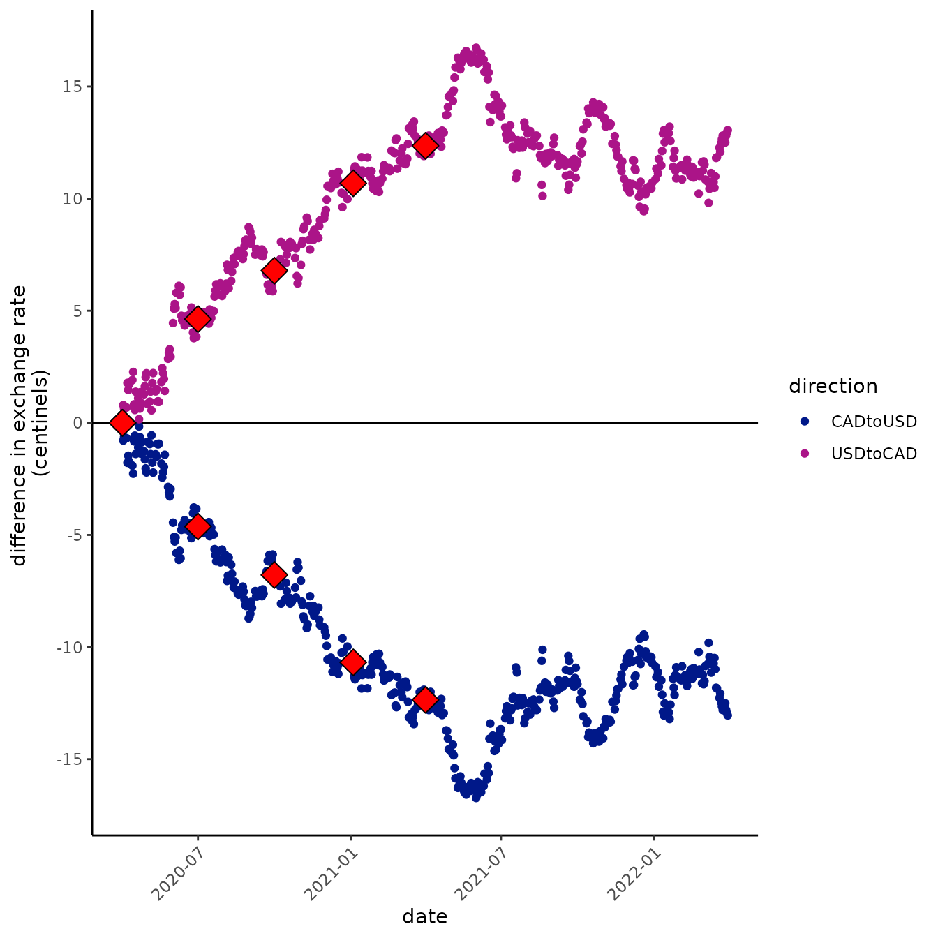
The nel and centinel scales compared to other divmult options
“Centinels” look like they could be nice units for staring at this, but what the heck is 1 centinel? Amazingly, a centinel isn’t that funky a unit. Plus one centinel is pretty close to a 1% increase!
let’s take a look:
x <- c(100, 5, pi)
# 1% increase
y <- x*1.01
z <- x *0.99
w <- x / 1.01
centinel <- function(x, ref){
  100*log(x/ref)
}

percent <- function(x, ref){
  100*(x/ref -1)
}


percent(y, x)
#> [1] 1 1 1
# it's pretty close
centinel(y, x)
#> [1] 0.9950331 0.9950331 0.9950331


# compare to decreases
percent(z, x)
#> [1] -1 -1 -1
# these are all close too
percent(w, x)
#> [1] -0.990099 -0.990099 -0.990099

centinel(z, x)
#> [1] -1.005034 -1.005034 -1.005034
centinel(w, x)
#> [1] -0.9950331 -0.9950331 -0.9950331

# percents go additively, though. So it's hard to think about compounding them
# which is what we usually want to do when things change

# if COVID went up by 1% a day for five consecutive days, it would go up by
# about 5 %.
1.01^5
#> [1] 1.05101
# But if it went up by 1% a day for fifty consecutive days
1.01^50
#> [1] 1.644632
# it would go up by more than 60%. This can really trip me up!

# centinels compound much more sensibly

compounded <- function(x, change, times){
  x*change^times
}

# compound 1% 50 times, you get a 64% increase
percent(compounded(x, 1.01, 50), x)
#> [1] 64.46318 64.46318 64.46318

# but a 50 centinel increase :-)
centinel(compounded(x, 1.01, 50), x)
#> [1] 49.75165 49.75165 49.75165

# try going backwards
percent(compounded(x, 0.99, 50), x)
#> [1] -39.49939 -39.49939 -39.49939
# that's annoying. Only 39% now?!?!


centinel(compounded(x, 0.99, 50), x)
#> [1] -50.25168 -50.25168 -50.25168
# still a change of 50 centinels

# and more precisely opposite
centinel(compounded(x, 1/1.01, 50), x)
#> [1] -49.75165 -49.75165 -49.75165