Ratio-based position scales for continuous data (x & y)
scale_ratio.Rdscale_x_ratio and scale_y_ratio are alternatives to traditional
scale_*_continuous scales for continuous x and y aesthetics, to explicitly
highlight multiplicative or geometric value changes. Rather than traditional
log transformations (as in scale_*_log10()), which rescale the axis and
return tickmarks on the original scale of the data, scale_*_ratio axis tick
values represent a multiplicative change from a reference point. These scales
may be especially useful for highlighting proportional changes.
Arguments
- tickVal
Character, one of "divMult", "propDiff", "percDiff", "nel", or "centiNel"
- ...
Additional arguments passed to
scale_y_continuousor other scale elements (e.g., breaks, labels, etc. )
Details
Logarithmic transformations make multiplicative changes additive,
and are often used to highlight relative change. It is traditional to
rescale an axis logarithmically and mark ticks with original scale values
(e.g. scale_y_log10)). scale_*_ratio provides
an alternative, marking ticks with transformed values. This may be
especially useful when comparing relative changes of quantities with
different units.
Five ratio scales are provided (and denoted with the tickVal argument):
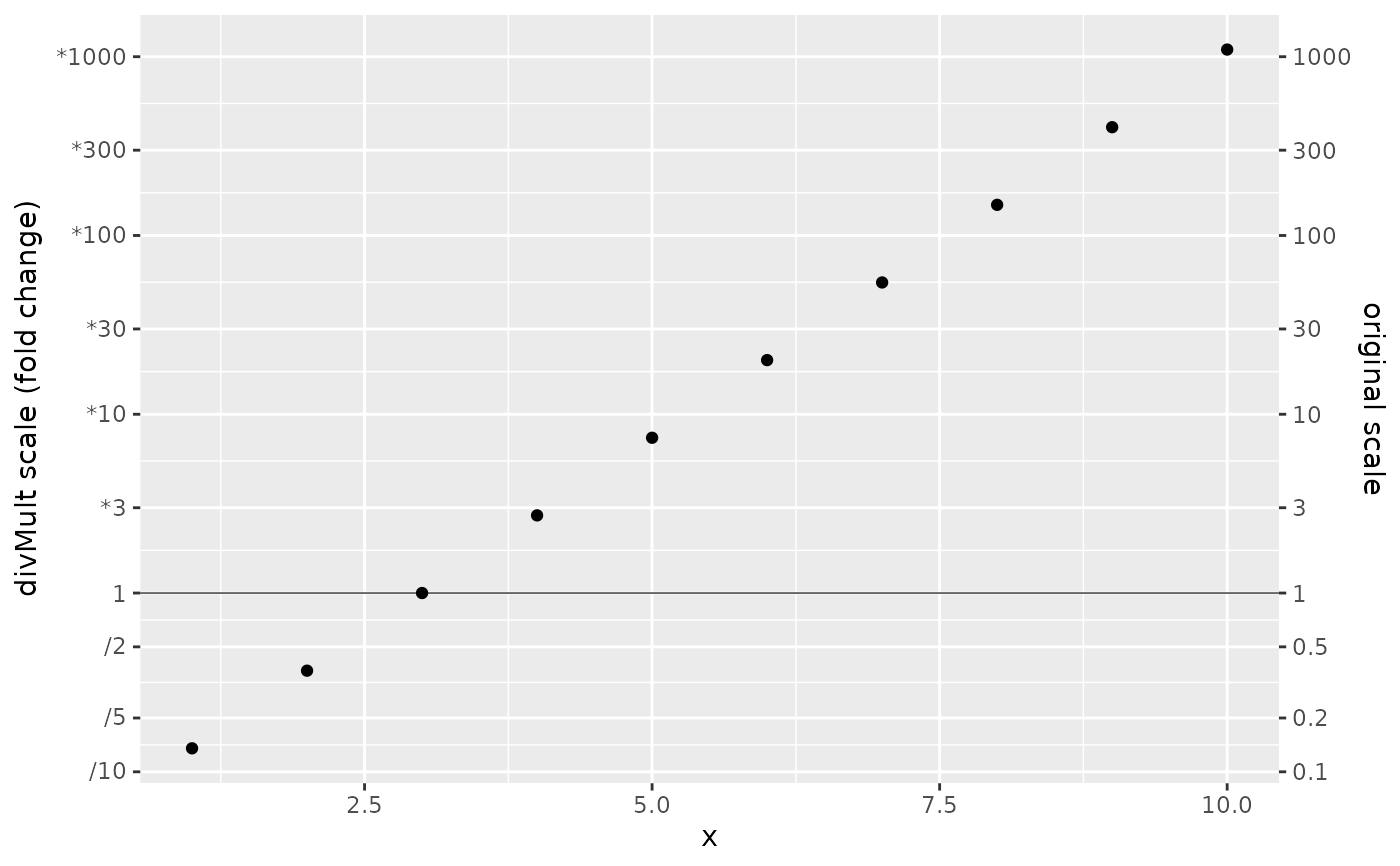
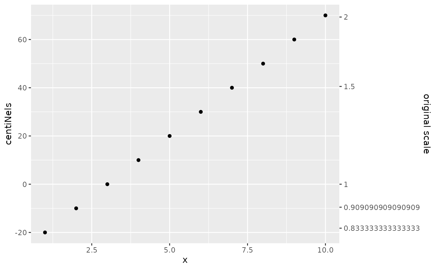
divMultrescales an axis logarithmically, and prints multiplicative changes for axis ticks, explicitly noting the operator ( \(\times\) or \(\div\)). This scale highlights symmetry between division and multiplication (\(a \times 2\) is equally far from \(a\) as is \(a \div 2\)).nelrescales an axis logarithmically, and marks it in units of "nels" (for _N_atural _L_ogarithm).centiNelrescales an axis logarithmically, and marks it in units of "centinels," i.e. one hundredth of a "nel". These may be more appropriate for small changes (i.e. of a few to a few hundred percents)
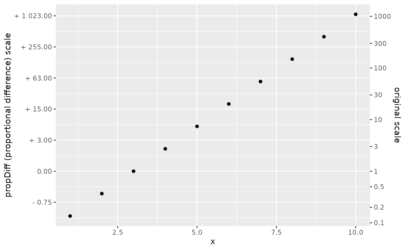
-propDiff rescales an axis logarithmically, but marks axes in terms of a
proportional difference from the reference point. Unlike when
proportions are plotted on an arithmetic scale, the propDiff
transformation reveals underlying geometric symmetry: (\(a \times 2\) is
equally far from \(a\) as is \(a \div 2\)) graphically, but tick values
indicate the more familiar proportional changes \(+ 1\), \(-0.5\).
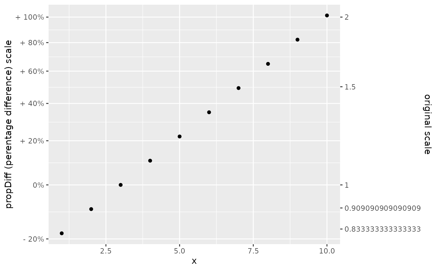
-percDiff rescales an axis logarithmically, but marks axes in terms of a
percentage difference from the reference point. Unlike when percentages
are plotted on an arithmetic scale, the percDiff transformation reveals
underlying geometric symmetry: (\(a \times 1.25\) is equally far from
\(a\) as is \(a \div 1.25\)) graphically, but tick values indicate the
more familiar proportional changes \(+ 25\%\), \(- 20\%\).
For small changes, "centinels" and percentage difference may be preferable, while for larger changes, "nels" (and possibly proportional difference) may be preferable.
Typically, the data passed to scale_*_ratio should be centered on a
reference value in advance.
Examples
smaller <- data.frame(x = 1:10, y = exp(seq(-0.2, 0.7, 0.1)))
bigger <- data.frame(x = 1:10, y = exp(-2:7))
ax2 <- ggplot2::sec_axis(
          labels = function(x) {x}
          , transform = ~.
          , breaks = breaks_divMult(n = 7, splits = 2)
          , name = "original scale"
        )

bigger %>%  ggplot2::ggplot(ggplot2::aes(x,y)) +
     ggplot2::geom_point() +
     ggplot2::geom_hline(yintercept = 1, linewidth = 0.2) +
     scale_y_ratio(tickVal = "divMult"
     , slashStar = TRUE
     , sec.axis = ax2
     ) +
        ggplot2::labs(y = "divMult scale (fold change)")


smaller %>%  ggplot2::ggplot(ggplot2::aes(x,y)) +
     ggplot2::geom_point() +
     scale_y_ratio(tickVal = "centiNel"
    , sec.axis = ax2
     ) +
        ggplot2::labs(y = "centiNels")


# propDiff is a little strange
bigger %>%  ggplot2::ggplot(ggplot2::aes(x,y)) +
     ggplot2::geom_point() +
     scale_y_ratio(tickVal = "propDiff"
                   , sec.axis = ax2
        ) +
        ggplot2::labs(y = "propDiff (proportional difference) scale")
#> Warning: 'base = 2' chosen by defaut. Setting base of log affects breaking function behavior, and 'exp(1)' may give strange-looking numbers for the propDiff scale


# percDiff should be familiar
smaller %>%  ggplot2::ggplot(ggplot2::aes(x,y)) +
     ggplot2::geom_point() +
     scale_y_ratio(tickVal = "percDiff"
     , sec.axis = ax2) +
        ggplot2::labs(y = "propDiff (perentage difference) scale")
