Logarithmic axis scales can clearly communicate multiplicative changes; they can also confuse. ratioScales annotates logarithmic axis scales with tickmarks that denote proportional and multiplicative change simply and explicitly.
The main function in this package, scale_*_ratio(), is ggplot-friendly and works similarly to existingscale_*_* functions from ggplot2 and scales.
Installation
You can install the development version of ratioScales from GitHub with:
# install.packages("remotes")
remotes::install_github("mikeroswell/ratioScales")
Example
Consider exchange rates between US and Canadian dollars:
exch %>%
  ggplot(aes(date, exRate, color = direction)) +
  geom_point() +
  scale_color_manual(values = hcl.colors(4, "Plasma")[c(1,2)]) +
labs(y = "exchange rate") 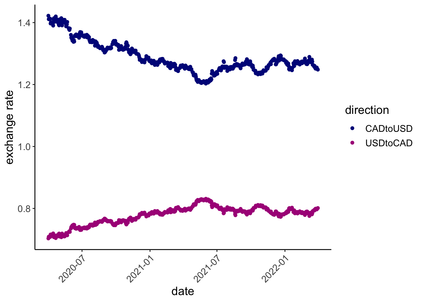
Exchange rates between US and Canada during the COVID-19 pandemic
Let’s see, relative to some baseline (1 April 2020), is the Canadian dollar gaining or losing ground against the US dollar, and by how much?
 exch %>%  ggplot(aes(date, exRate_scale, color = direction)) +
   geom_hline(yintercept = 1, color = "black")+
   geom_point() +
   scale_color_manual(values = hcl.colors(4, "Plasma")[c(1,2)]) +
   geom_hline(yintercept = 0.85
              , color = hcl.colors(4, "Plasma")[1], linetype = 3) +
   geom_hline(yintercept = 1.15
              , color = hcl.colors(4, "Plasma")[2], linetype = 5) +
  # FUNCTION FROM ggplot2
   scale_y_continuous(breaks = seq(80, 130, 5)/100) +
labs(y = "proportional change in exchange rate") 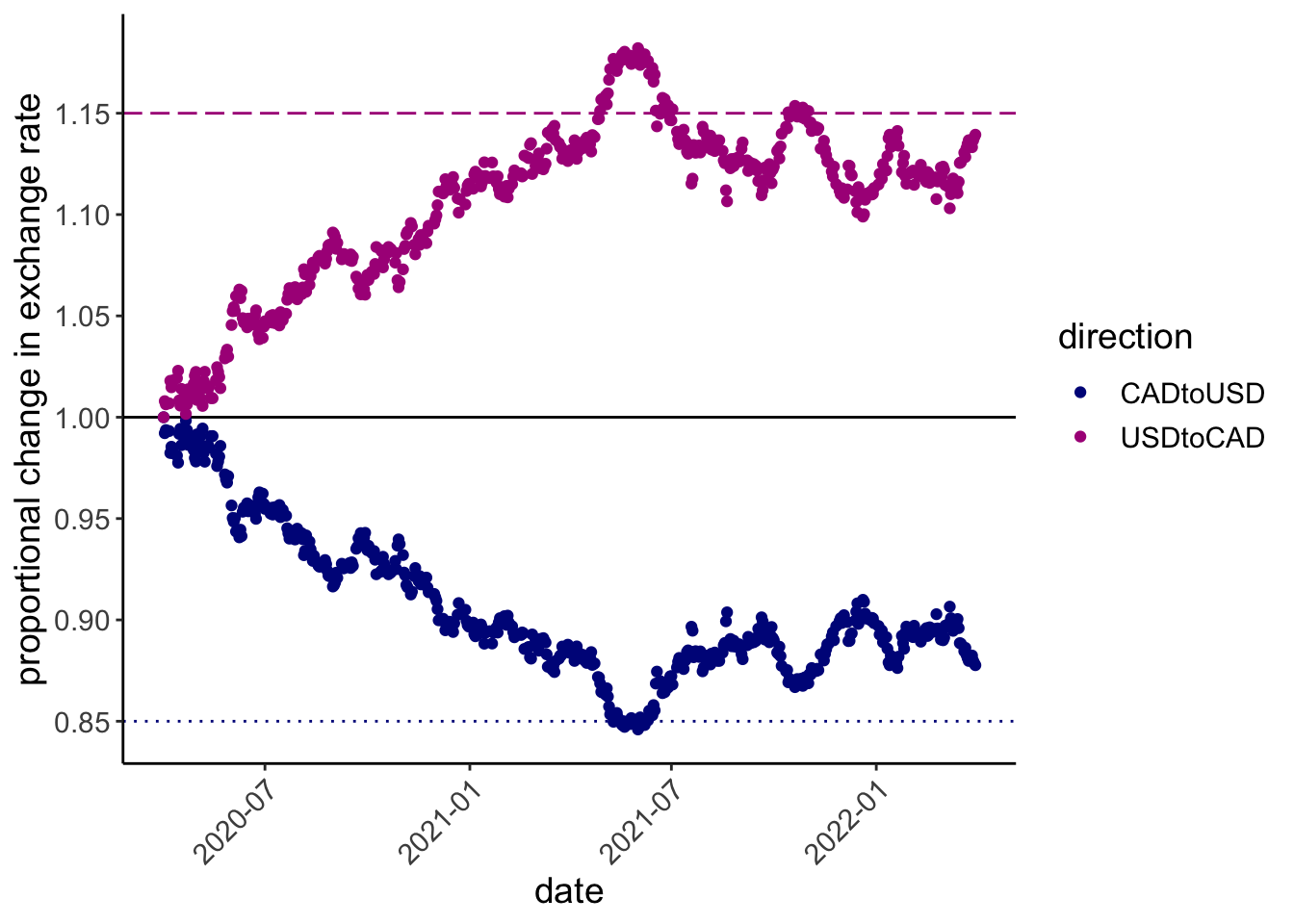
Proportional change in exchange rate from 1 April 2020 to 1 April 2022
But this is strange! Somehow the Canadian dollar weakened by a maximum of 15% before rebounding, but the US dollar strengthened by much more than 15%. Maybe not the best way to think about this?
ratioScales provides “rational” alternatives.
divMult scale
The “divMult” scale in ratioScales shows absolute ratios, prefaced by an operator sign (e.g., × or ÷), allowing easy and accurate comparison of multiplicative changes.
exch %>%  ggplot(aes(date, exRate_scale, color = direction)) +
   geom_hline(yintercept = 1, color = "black")+
  # times and divided by 1.15; longdash
   geom_hline(yintercept = 1/1.15
              , color = hcl.colors(4, "Plasma")[1]
              , linetype = 5) +
   geom_hline(yintercept = 1.15
              , color = hcl.colors(4, "Plasma")[2]
              , linetype = 5) +
  # times and divided by 0.85; dotted
   geom_hline(yintercept = 1/0.85
              , color = hcl.colors(4, "Plasma")[2]
              , linetype = 3) +
   geom_hline(yintercept = 0.85
              , color = hcl.colors(4, "Plasma")[1]
              , linetype = 3) +
   geom_point() +
   scale_color_manual(values = hcl.colors(4, "Plasma")[c(1,2)]) +
  # FUNCTION FROM ratioScales
   scale_y_ratio(tickVal = "divMult", n = 12, nmin = 12, slashStar = FALSE) +
labs(y = "multiplicative change in exchange rate") 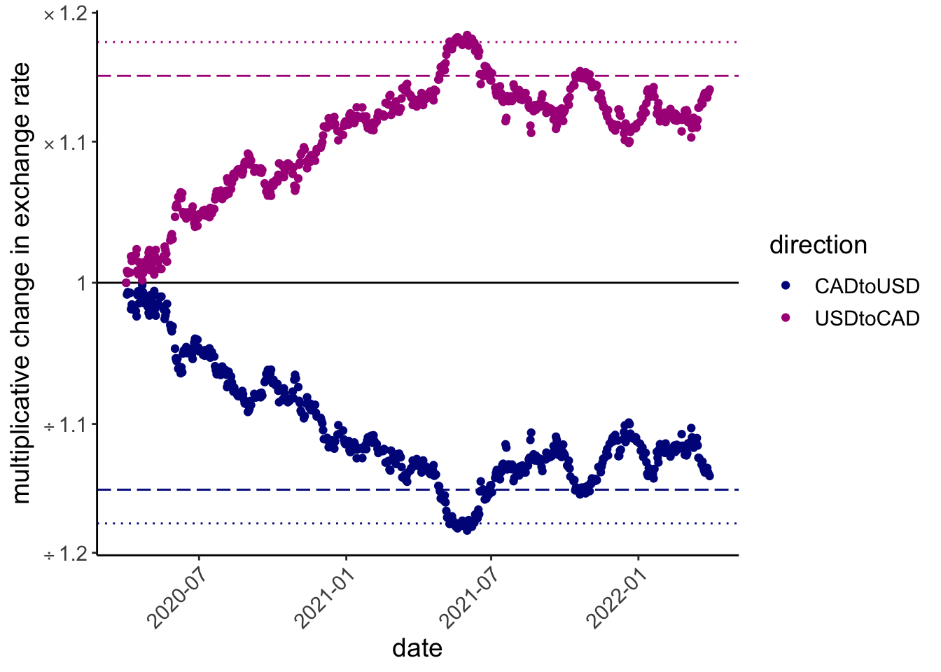
exchange rate changes on the divMult scale
percDiff
Prefer percentage differences? You can do this in a principled fashion using scale_y_ratio(tickVal = "percDiff").
exch %>%  ggplot(aes(date, exRate_scale, color = direction)) +
   geom_hline(yintercept = 1, color = "black")+
  # times and divided by 1.15; longdash
   geom_hline(yintercept = 1/1.15
              , color = hcl.colors(4, "Plasma")[1]
              , linetype = 5) +
   geom_hline(yintercept = 1.15
              , color = hcl.colors(4, "Plasma")[2]
              , linetype = 5) +
  # times and divided by 0.85; dotted
   geom_hline(yintercept = 1/0.85
              , color = hcl.colors(4, "Plasma")[2]
              , linetype = 3) +
   geom_hline(yintercept = 0.85
              , color = hcl.colors(4, "Plasma")[1]
              , linetype = 3) +
   geom_point() +
   scale_color_manual(values = hcl.colors(4, "Plasma")[c(1,2)]) +
    # FUNCTION FROM ratioScales
   scale_y_ratio(tickVal = "percDiff") +
labs(y = "percentage difference in exchange rate") 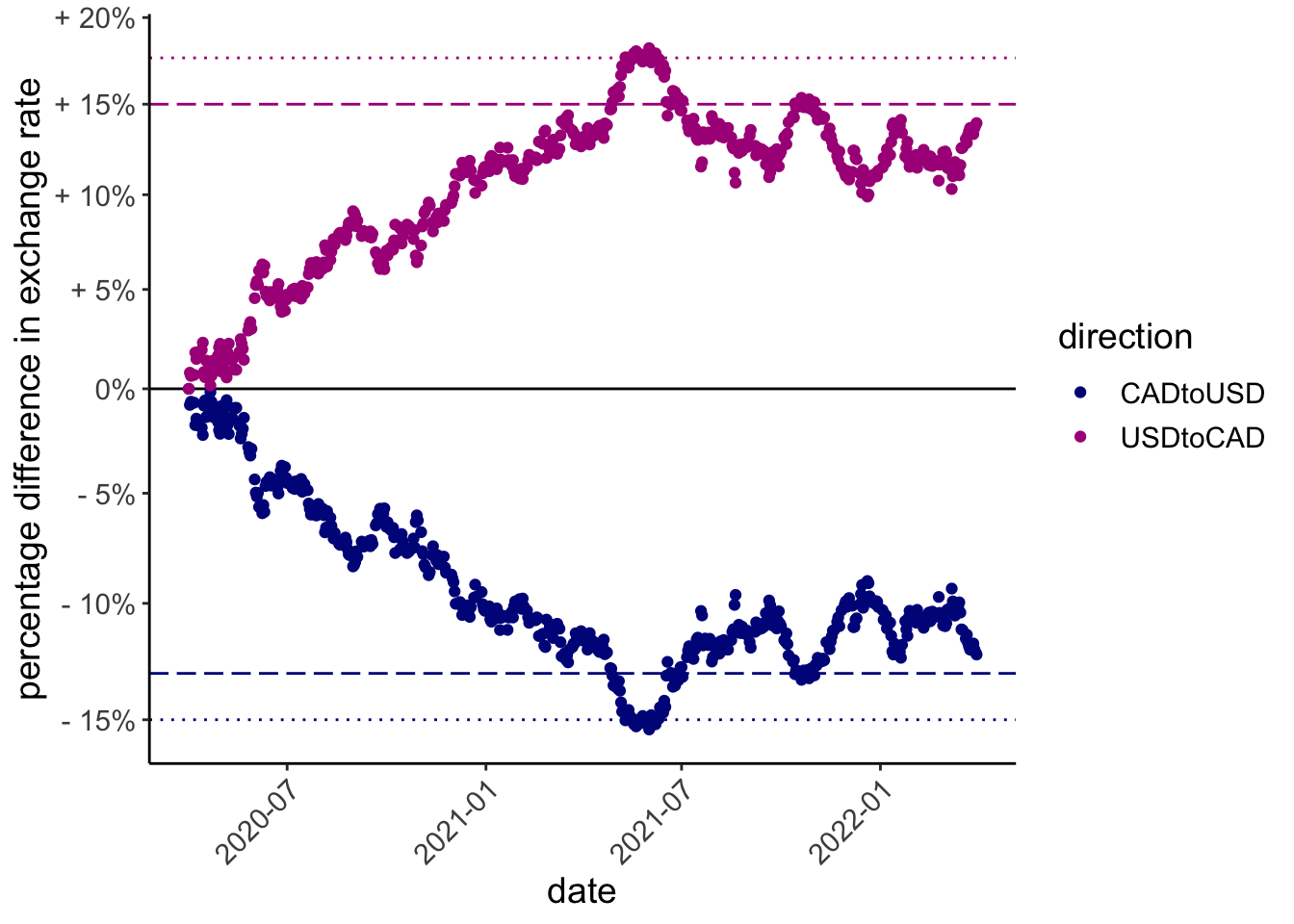
caption explaining the reference lines
This preserves the true ratio-based differences on the visual plot, but the values on the guide (round number percents) do not correspond simply to ratio differences (and are not symmetric, see plot).