Estimating mean rarity
Estimating_Mean_Rarity.RmdThe MeanRarity package contains functions to compute,
estimate, and visualize Hill numbers, using the framework that Hill
numbers simply compute the abundance-weighted [generalized] mean species
rarity of a community (rarity is the reciprocal of relative abundance).
Additionally, the package contains functions for generating and sampling
abundance vectors and generating plots. This vignette is not a
comprehensive guide to the package. However, it includes data and code
to replicate the quantitative main-text figures presented in Roswell, Dushoff, and Winfree (2021). Thus, the
examples in the vignette are ordered according to the figures in the
article.
The goal of [Hill] diversity metrics is to summarize the distribution
of species’ [relative] abundances. The first figure in the “Conceptual
guide” is a visualization of the observed bee abundances from the four
communities in the example dataset beeObs, analyzed in the
guide. The package also includes a summary of those data,
beeAbunds. The function radplot() takes those
data and returns a rank-abundance distribution plot. We love the new R
package patchwork for assembling plots, and call that
package here.
# to make RAD plot for communities comparable, use one maxab and one maxrich for all plots
maxab <- max(sapply(beeAbunds[2:5], max)) # the maximum observed species abundance in any community

maxrich <- max(sapply(beeAbunds[2:5], function(x){sum(x > 0)})) # maximum observed richness


myplots <- purrr::map(2:5, function(makedatind){
    radplot(beeAbunds[,makedatind], maxab = maxab, maxrich = maxrich
            , shape = 13 + makedatind # solid filled shapes
            , size = 1.5
            , fill = c("#1b9e77", "#d95f02", "#7570b3", "#e7298a")[makedatind - 1]) +
    ggplot2::labs(title = ggplot2::element_blank()) +
    ggplot2::theme(text = ggplot2::element_text(size = 14)
                   , axis.text = ggplot2::element_text(colour = "black"))
})


myplots[[1]] + # first community
  ggplot2::labs(x = "") +# syling
white_y(myplots[[3]]) + # second community
  ggplot2::labs(x = "") + # styling
myplots[[2]] +  # third community
white_y(myplots[[4]]) # fourth community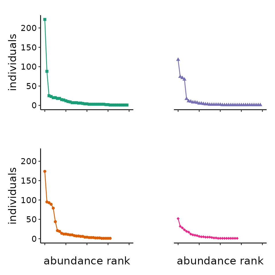
The next figure in the guide shows that the expected value for both
observed and estimated asymptotic richness increase with sample size.
The code to generate expected diversity estimates is computationally
expensive and we recommend not to run the code in this vignette. It is
documented in the package in the file "data-raw/DATASET.R",
and the result is an exported dataset mean_ests. This
script uses the function subsam(), which samples without
replacement, and the function obs_est(), which computes
Hill diversity estimates, including asymptotic estimates (Chao and Jost 2015) using functions modified
from the R package SpadeR
# this takes a long time to run so we're going to stash it but export the data it creates

sz<-1:745 #sample sizes from 1 to maximum observed total abundance at a site
nrep<-200 #Large enough because estimating means

#tictoc::tic() #time this
nc <- parallel::detectCores() - 1 #nc is number of cores to use in parallel processing
future::plan(strategy = future::multiprocess, workers = nc) #this sets up the cluster


div_ests <- purrr::map_dfr(1:nrep, function(k){
 furrr::future_map_dfr(sz, function(x){
    map(2:length(beeAbunds), function(sitio){
      f<-beeAbunds %>% dplyr::select(all_of(sitio))
      if(sum(f) > x){
        comm = dplyr::pull(f) %>% subsam(size = x)
        return(data.frame(obs_est(comm)
                     , site = names(f)))
      }
    })
  })
})

#tictoc::toc() #507 seconds with quad-core i7 processor, not bad.
mean_narm <- function(x){mean(x, na.rm = T)}
mean_ests <- div_ests %>%
  dplyr::group_by(site, individuals) %>%
  dplyr::summarize_all(mean_narm)
site_ab <- purrr::map_dfr(names(beeAbunds[,2:5]), function(site){
  data.frame(site, abun = sum(beeAbunds[,site]))
})

mean_ests %>%
  dplyr::left_join(site_ab) %>%
  dplyr::mutate(cutrows = individuals > 0.8 * abun) %>%
  #truncate the dataset because literal bootstrapping gets funny and  the Chao1
  #levels off near observed abundance, didn't want to discuss this in guide
  #since it's obvious but not interesting and possibly very confusing.
  dplyr::filter(!cutrows) %>%
  ggplot2::ggplot(aes(individuals, obsrich, color = site))+
  ggplot2::geom_point(alpha = 0.3, size = 0.5) +
  ggplot2::geom_point(aes(y = chaorich, color = site, shape = site)
             , size=0.8, alpha=0.5) +
  ggplot2::theme_classic() +
  ggplot2::labs(x = "\nIndividuals", y = "Species richness\n") +
  ggplot2::xlim(c(0, 400)) +
  ggplot2::ylim(c(0, 80)) +
  ggplot2::theme(text = ggplot2::element_text(size=14)
        , axis.text = ggplot2::element_text(colour = "black")) +
  ggplot2::theme(legend.position = "none") +
  ggplot2::scale_shape_manual(values = c(15:18)) +
  ggplot2::scale_color_brewer(palette = "Dark2")
#> Joining with `by = join_by(site)`
#> Warning: Removed 257 rows containing missing values or values outside the scale range
#> (`geom_point()`).
#> Removed 257 rows containing missing values or values outside the scale range
#> (`geom_point()`).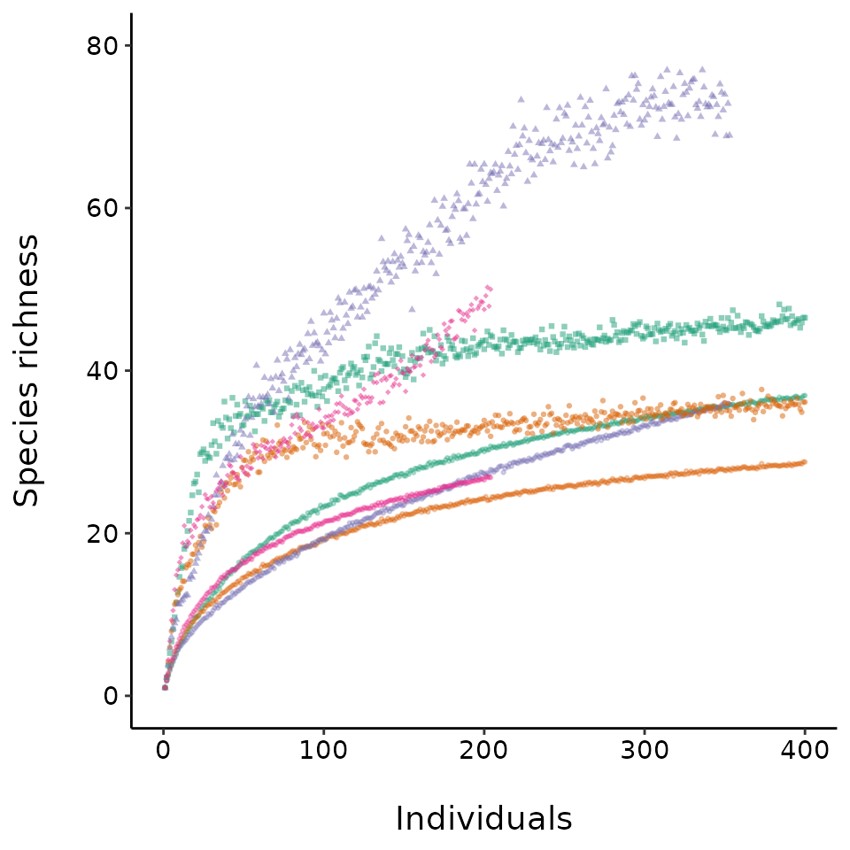
Figure 3 in the guide shows an empirical Hill diversity profile. The
MeanRarity package has a function to produce such profiles,
divpro(). This lightweight function does not produce
asymptotic estimates. Because the guide focused on the mean rarity
formulation for Hill diversities, parameterizing the scaling exponent
with \(\ell\), the profile is plotted
from \(\ell = -1\) to \(\ell =1\), whereas other software packages
such as iNEXT and SpadeR plot the profile from
\(q = 1-\ell =0\) to \(q = 1-\ell =2\).
site_pro <- purrr::map_dfr(names(beeAbunds[2:5]), function(x){
  data.frame(site = x, divpro(beeAbunds[, x]))}) #make profile for each community

site_pro %>%  ggplot2::ggplot(aes(ell, d, color = site)) +
    ggplot2::geom_line() +
    ggplot2::geom_point(data = site_pro %>%
                          dplyr::filter(ell %in% c(-1,1,0))
               , aes(ell, d, color = site, shape = site)
               , size = 3, alpha = 0.5) +
    ggplot2::theme_classic() +
    ggplot2::theme(text = ggplot2::element_text(size = 14)
          , axis.text = ggplot2::element_text(colour = "black")
          , legend.position = "none") +
    #this is the unicode for the curly l
    ggplot2::labs(x = "Exponent \U2113", y = "Diversity") +
    ggplot2::scale_shape_manual(values = c(15:18)) +
    ggplot2::scale_color_brewer(palette = "Dark2")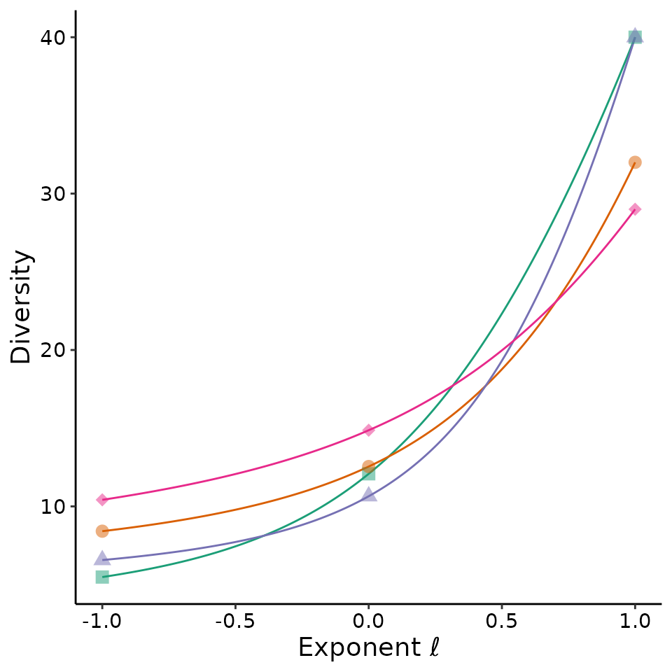
A central idea in the guide is that researcher decisions can drive the results of biodiversity comparisons: how much to sample, how to standardize data, which diversity metric to use, and how to express uncertainty. Figure 4 illustrates how some of these choices could alter interpretation of the example dataset.
The code below does not highlight any of the novel tools in the
MeanRarity package. However, it does use
Chao_Hill_abu(), a copy of an internal function from the R
package SpadeR. To produce fig 4 in the MS, we used the R
package iNEXT, which is not imported by
MeanRarity. It also uses our simplified version of the code
for computing approximate CI from iNEXT, an internal
function MeanRarity:::Bootstrap.CI_Df(). This computes the
same intervals as iNEXT. Although elsewhere in the Oikos
forum piece, we critique these intervals, we included them in this
figure to demonstrate how the choice of tools would or would not drive
results.
This code chunk will likely take almost a minute to run.
#tictoc::tic() #time this

iN_form <- as.list(beeAbunds[, -1])
by_size <- iNEXT::estimateD(iN_form
                                , base = "size")

by_coverage <- iNEXT::estimateD(iN_form
                                , base = "coverage")

by_effort <- purrr::map_dfr(lapply(iN_form, sum), function(size){
    iNEXT::estimateD(iN_form
                    , base = "size"
                    , level = size) %>%
    dplyr::filter(Method == "Observed")

})

iseveral <- dplyr::bind_rows(size = by_size
                             , coverage = by_coverage
                             , effort = by_effort
                             , .id = "standard") %>%
  dplyr::mutate(order = 1 - Order.q)

#tictoc::toc()  #43 sec this time!?!?!

#tictoc::tic()
asyseveral <- purrr::map_dfr(2:5, function(sitio){
  purrr::map_dfr(-1:1, function(l){
    theboots <- MeanRarity:::Bootstrap.CI_df(pull(beeAbunds[, sitio]), l)
    est <- Chao_Hill_abu(dplyr::pull(beeAbunds[, sitio]), l)
    data.frame(Assemblage = names(beeAbunds[, sitio])
               , order = l
               , qD = est
               , qD.LCL = est - theboots[2]
               , qD.UCL = est + theboots[4])
  })
})
#tictoc::toc() # <2 seconds.

asyseveral$Method <- "asymptotic"
asyseveral$standard <- "asymptotic"
allseveral <- dplyr::bind_rows(iseveral, asyseveral)
#diversities, standardized by effort

#get some parameters of data
#individuals in sample with fewest
minm <- min(by_effort %>%
              dplyr::filter(m == min(m)) %>%
              dplyr::pull(m))

minc <- min(by_effort %>%
              dplyr::group_by(Assemblage) %>%
              dplyr::summarize(SC = max(SC)) %>%
              dplyr::pull(SC)) # coverage of sample with lowest


tog <- allseveral %>%
  dplyr::mutate(sm = paste(standard, Assemblage, sep=""))

inds <- data.frame("order" = c(1, 0, -1), divind = factor(c("richness"
                                                           , "Hill-Shannon"
                                                           , "Hill-Simpson")
                                                 , levels = c("richness"
                                                              , "Hill-Shannon"
                                                              , "Hill-Simpson")))

togn <- tog %>%
  dplyr::left_join(inds) %>%
  dplyr::ungroup()
#> Joining with `by = join_by(order)`

togn <- togn %>%
  dplyr::mutate(divind = factor(divind
                         , levels = c("richness"
                                      , "Hill-Shannon"
                                      , "Hill-Simpson"))
          , site = factor(Assemblage
                          , levels = c("IAS_3"
                                     , "Cold Soil_5"
                                     , "Lord Stirling_4"
                                     , "Fox Hill_5")))
togn <- togn %>%
  dplyr::mutate(methlab = factor(standard
                          , levels = c("effort"
                                       , "size"
                                       , "coverage"
                                       , "asymptotic")
                           , labels = c("effort (14 transects)"
                                        , "size (255 individuals)"
                                        , "coverage (95.7%)"
                                        , "asymptotic")))
ebsize<-0.6
ebw<-0.4
psize<-2.5

############################
# make figures, which get stuck together.
leftPlot <- togn %>%
    dplyr::filter(methlab != "asymptotic") %>%
    ggplot2::ggplot(aes(site, qD, color = site, shape = site)) +
    ggplot2::geom_errorbar(aes(ymin = qD.LCL, ymax = qD.UCL)
                  , linewidth = ebsize, width = ebw) +
    ggplot2::geom_point(size = psize) +
    ggplot2::facet_grid(divind ~ methlab, switch = "y", scales = "free_y") +
    ggplot2::theme_classic() +
    ggplot2::theme(legend.position = "none", axis.text.x = ggplot2::element_blank()
          , axis.ticks.x = ggplot2::element_blank()) +
    ggplot2::labs(y = NULL) +
    ggplot2::theme(panel.spacing = unit(0, "lines")
          , panel.border = ggplot2::element_rect(fill = NA)
          , strip.background = ggplot2::element_blank()
          , strip.text = ggplot2::element_text(face = "bold", size = 10)
          , axis.title.x = ggplot2::element_blank()
          , legend.position = "none"
          , strip.placement = "outside") +
    ggplot2::scale_y_continuous(limits = c(0,NA)
                       , expand = ggplot2::expansion(mult = c(0, .05))) +
    ggplot2::scale_shape_manual(values = c(17, 15, 18, 16)) +
    ggplot2::scale_color_manual(values = c("#7570b3"
                                , "#1b9e77"
                                , "#e7298a"
                                , "#d95f02"))
rightPlot <- togn %>%
  dplyr::filter(methlab == "asymptotic") %>%
  ggplot2::ggplot(ggplot2::aes(site, qD, color = site, shape = site)) +
  ggplot2::geom_errorbar(ggplot2::aes(ymin = qD.LCL, ymax = qD.UCL)
                         , linewidth = ebsize, width = ebw) +
  ggplot2::geom_point(size = psize) +
  ggplot2::facet_grid(divind~methlab, switch = "y", scales = "free_y") +
  ggplot2::theme_classic() +
  ggplot2::theme(legend.position = "none"
                 , axis.text.x = ggplot2::element_blank()
                 , axis.ticks.x = ggplot2::element_blank()) +
  ggplot2::labs(y = NULL, x = NULL) +
  ggplot2::theme(panel.spacing = unit(0, "lines")
                 , panel.border = ggplot2::element_rect(fill = NA)
                 , strip.background = ggplot2::element_blank()
                 , strip.text.x = ggplot2::element_text(face = "bold"
                                                        , size = 10)
                 , strip.text.y = ggplot2::element_blank()
                 , axis.title = ggplot2::element_blank()
                 , legend.position = "none"
                 , strip.placement = "outside") +
  ggplot2::scale_y_continuous(limits = c(0, NA)
                     , expand = ggplot2::expansion(mult = c(0, 0.05))) +
  ggplot2::scale_shape_manual(values = c(17, 15, 18, 16)) +
  ggplot2::scale_color_manual(values = c("#7570b3"
                              , "#1b9e77"
                              , "#e7298a"
                              , "#d95f02" ))

# throwing errors 20230420
#leftPlot + rightPlot + plot_layout(widths = c(3, 1))
A key idea is that the amount of sampling itself (and not simply
standardization) itself affects relative biodiversity estimates. We
demonstrated this in the MS with Figure 5. Although the
MeanRarity package exports sample_finite(),
sample_finite(), and subcom(), all convenience
functions for sampling community data, to produce Fig. 5 no tools from
MeanRarity were used.
# this takes a long time to run so we're going to stash it but export the data
# in the package

# the idea here is to sample from 14 30-minute sampling bouts from each site and
# compare coverage. While we resample 30-minute transects, we compute the
# estimated sample coverage and count individuals in each subsample. We use this
# to compare standardization methods.

maxeff <- 14
reps <- 9999
#tictoc::tic() #time this
nc <- parallel::detectCores() - 1 #nc is  cores to use in parallel processing
future::plan(strategy = future::multiprocess, workers = nc) # sets up cluster

show_ests <- furrr::future_map_dfr(1:reps, function(x){
  purrr::map_dfr(1:maxeff, function(i){
    sam <- beeObs %>%
      dplyr::group_by(sr) %>%
      dplyr::do(dplyr::filter(., start %in%
                         sample(unique(.$start)
                                , size = maxeff - i + 1
                                , replace = F)))
    subcom <- sam %>% dplyr::group_by(bee, sr) %>%
      dplyr::summarize(abund = n()) %>%
      tidyr::spread(key = sr
                    , value = abund
                    , fill = 0) %>%
      as.data.frame()
    basicdat <- purrr::map_dfr(apply(subcom[, -1], MARGIN = 2, obs_est), rbind)
    return(data.frame(basicdat
                      , site = names(subcom[, -1])
                      , transects = maxeff - i + 1))
  })
})

#tictoc::toc() #Under 2 hours with only 4 cores

effort_means <- show_ests %>%
  dplyr::group_by(site, transects) %>%
  dplyr::summarize_at(.vars = c("n"
                              , "coverage"
                              , "obsrich"
                              , "chaorich"
                              , "obsshan"
                              , "chaoshan"
                              , "obssimp"
                              , "chaosimp"), .funs = mean)


#gather to make a prettier plot, will need to get fancy now that there's asy also
effort_rare <- effort_means %>% dplyr::rename(
  "richness_observed" = obsrich
  , "richness_asymptotic" = chaorich
  , "Hill-Shannon_observed" = obsshan
  , "Hill-Shannon_asymptotic" = chaoshan
  , "Hill-Simpson_observed" = obssimp
  , "Hill-Simpson_asymptotic" = chaosimp
  , size = n
  , effort = transects) %>%
  tidyr::gather(key = "ell"
                , value = "diversity"
                , "richness_observed"
                , "richness_asymptotic"
                , "Hill-Shannon_observed"
                , "Hill-Shannon_asymptotic"
                , "Hill-Simpson_observed"
                , "Hill-Simpson_asymptotic") %>%
  tidyr::gather(key = method
                , value =xax
                , effort
                , size
                , coverage) %>%
  tidyr::separate(ell, c("divind", "etype"), sep = "_")

effort_rare$divind <- factor(effort_rare$divind
                          , levels = c("richness"
                                       , "Hill-Shannon"
                                       , "Hill-Simpson")
                          , labels = c("richness"
                                     , "Hill-Shannon"
                                     , "Hill-Simpson"))
effort_rare$method <- factor(effort_rare$method
                          , levels = c("effort"
                                     , "size"
                                     , "coverage"))
effort_rare$etype <- factor(effort_rare$etype
                         , levels = c("observed"
                                      , "asymptotic"))
effort_rare %>%
  dplyr::filter(etype == "observed") %>%
  ggplot2::ggplot(aes(xax
             , diversity
             , color = site
             , shape = site)) +
  ggplot2::geom_point(size = 2) +
  ggplot2::geom_line() +
  ggplot2::theme_classic() +
  ggplot2::scale_alpha(range=c(0.4, 0.8)) +
  ggplot2::theme( legend.position = "none"
         , axis.text = ggplot2::element_text(colour = "black")
         , axis.title.y = ggplot2::element_text(size = 14)
         , panel.spacing = unit(1.3, "lines")
         , strip.placement.y = "outside") +
  ggplot2::labs(x = "    transects                            individuals                             % coverage    "
       , y = "diversity") +
  ggplot2::facet_grid(divind ~ method, scales = "free", switch = "y") +
  ggplot2::expand_limits(y = 0) +
  ggplot2::scale_shape_manual(values = c(15:18)) +
  ggplot2::scale_color_brewer(palette = "Dark2") +
  ggplot2::scale_y_log10()
#> Warning in ggplot2::scale_y_log10(): log-10 transformation
#> introduced infinite values.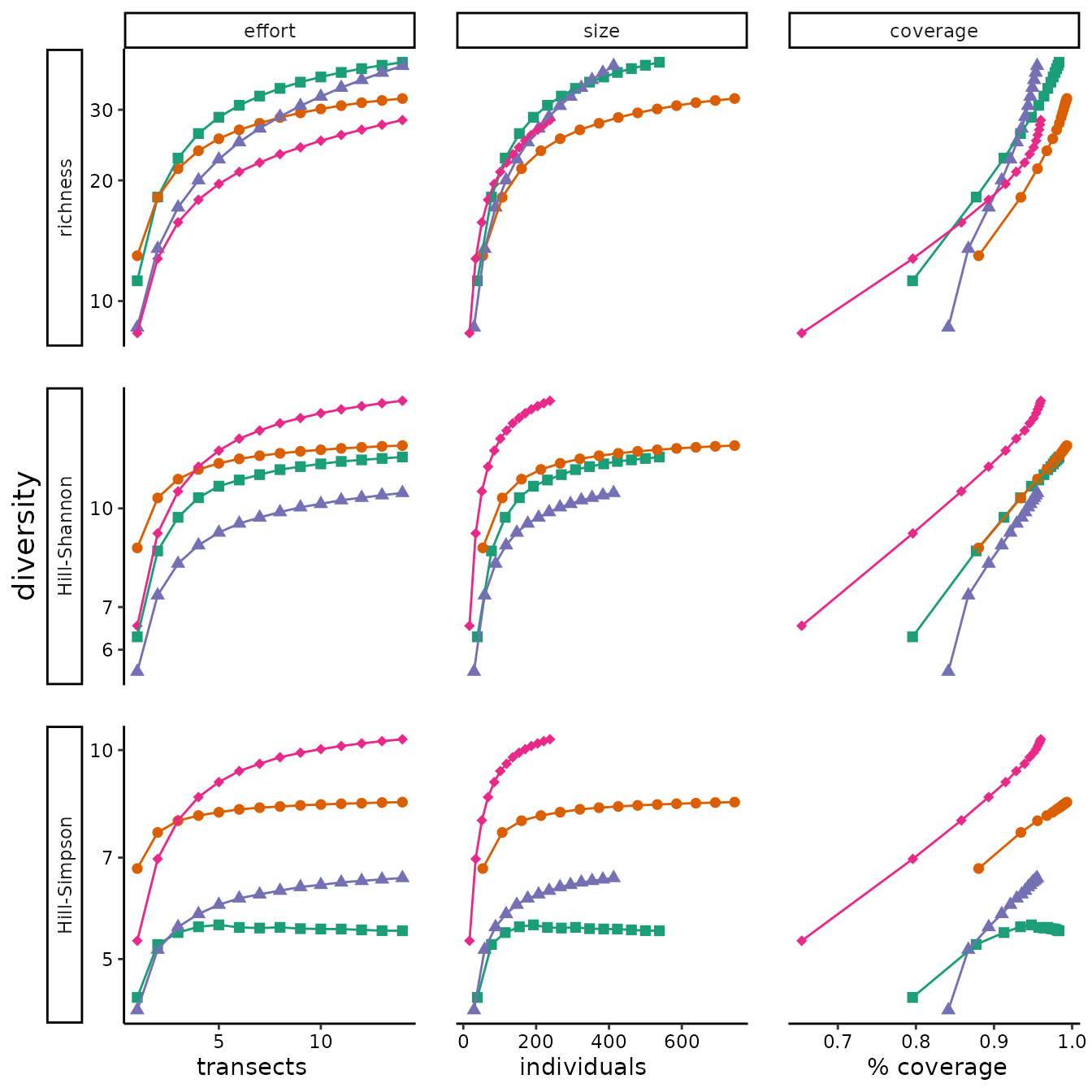
We examine whether the same sensitivities apply to asymptotic diversity estimates, which present an alternative to the data standardization approaches, in Appendix C. In fact, within the range of sampling completeness and unevennesses in our dataset, the asymptotic diversity estimators seem as unreliable as sample diversity in demonstrating relative differences in diversity between communities.
effort_rare %>%
  ggplot2::ggplot(ggplot2::aes(xax, diversity, color = site, shape = site)) +
  ggplot2::geom_line(ggplot2::aes(alpha = etype), size = 1) +
  ggplot2::theme_classic() +
  ggplot2::scale_alpha(range = c(0.4, 0.8)) +
  ggplot2::theme( legend.position = "none"
         , axis.text = ggplot2::element_text(colour = "black")
         , axis.title.y = ggplot2::element_text(size = 14)
         , panel.spacing = unit(0.3, "lines")
         , strip.placement.y = "outside") +
  # shoudl fix the spacing between x-axis labels
  ggplot2::labs(x = "    transects                                     individuals                                     % coverage    "
       , y = "diversity") +
  ggplot2::facet_grid(divind ~ method + etype, scales = "free", switch = "y") +
  ggplot2::expand_limits(y = 0) +
  ggplot2::scale_color_brewer(palette = "Dark2") +
  ggplot2::scale_y_log10() +
  ggplot2::scale_alpha_manual(values = c(1, 0.6))
#> Warning: Using `size` aesthetic for lines was deprecated in ggplot2 3.4.0.
#> ℹ Please use `linewidth` instead.
#> This warning is displayed once every 8 hours.
#> Call `lifecycle::last_lifecycle_warnings()` to see where this warning was
#> generated.
#> Scale for alpha is already present.
#> Adding another scale for alpha, which will replace the existing scale.
#> Warning in ggplot2::scale_y_log10(): log-10 transformation
#> introduced infinite values.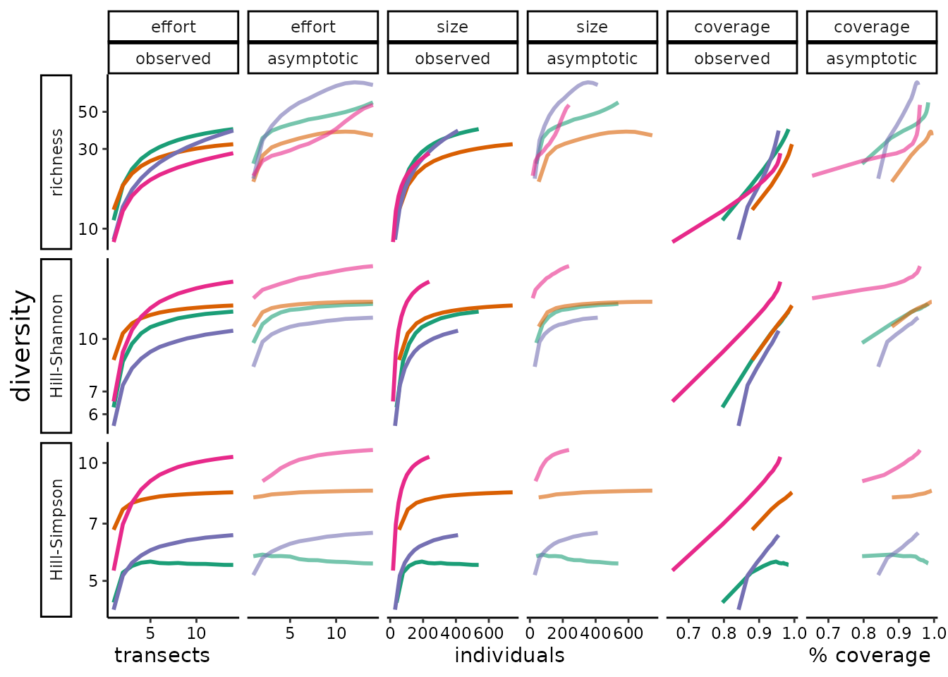
In Box 5, we visualize the mean rarity by finding a physical balance
point. We hope this helps clarify how rarity is scaled by different
means, but always weighted by the abundance of individuals. The function
rarity_plot() generates these figures. They can also be
generated interactively in the shiny app . The key thing to notice is
that while the scaling of rarity changes with the exponent \(\ell\), the weighting of each species stays
the same. This is the simplest way to see how Hill diversities compute
mean rarity from relative abundances, and we find the mean rarity
framework simpler than imagining that the scaling parameter
somehow adjusts species weighting.
The balance plots are fairly complex, and use several exported
functions from the MeanRarity package. They rely, of
course, on Hill diversity computations, with the function
rarity(), which in turn calls pfun() and
ipfun() to compute power transformations and their inverse.
Additionally, the plots are built with ggplot, and the curious reader
may wish to explore the code (and even suggest improvements!).
# plot some rarity "balance plots" for guide to measuring diversity (Roswell et al. 2021 http://onlinelibrary.wiley.com/doi/10.1111/oik.07202/abstract)
ab <- c(20,8,5,4,2,1)

rich_bal <- rarity_plot(ab, 1, base_size = 12) +
  ggplot2::labs(x = "") +
  scale_color_brewer(type = "qual", palette = "Dark2")
#>
#>      `rarity_plot()` expects a square viewport (likely issues in the RStudio
#>      plotting device) and resizes points based on `min(dev.size()` and ``noco`
#>      (for number of columns).
#>
#>      Selecting `lines = TRUE` will plot stacks of individuals as a line
#>      element, which tends to be more robust to window size.
#>
#>      Setting `lines = TRUE` may be the best way to deal with overplotting,
#>      which results from several species with similar but not identical
#>      rarities.
#> [1] "diversity = 6"            "community size = 40"
#> [3] "max observed rarity = 40" "min observed rarity = 2"
#> Scale for colour is already present.
#> Adding another scale for colour, which will replace the existing scale.

#do not return all the text this time
shan_bal <- white_y(rarity_plot(ab, 0, base_size = 12, verbose = F)) +
  scale_color_brewer(type = "qual", palette = "Dark2")
#>
#>      `rarity_plot()` expects a square viewport (likely issues in the RStudio
#>      plotting device) and resizes points based on `min(dev.size()` and ``noco`
#>      (for number of columns).
#>
#>      Selecting `lines = TRUE` will plot stacks of individuals as a line
#>      element, which tends to be more robust to window size.
#>
#>      Setting `lines = TRUE` may be the best way to deal with overplotting,
#>      which results from several species with similar but not identical
#>      rarities.
#> Scale for colour is already present.
#> Adding another scale for colour, which will replace the existing scale.

simp_bal <- white_y(rarity_plot(ab, -1, base_size = 12, verbose = F)) +
  ggplot2::labs(x = "") +
  scale_color_brewer(type = "qual", palette = "Dark2")
#>
#>      `rarity_plot()` expects a square viewport (likely issues in the RStudio
#>      plotting device) and resizes points based on `min(dev.size()` and ``noco`
#>      (for number of columns).
#>
#>      Selecting `lines = TRUE` will plot stacks of individuals as a line
#>      element, which tends to be more robust to window size.
#>
#>      Setting `lines = TRUE` may be the best way to deal with overplotting,
#>      which results from several species with similar but not identical
#>      rarities.
#> Scale for colour is already present.
#> Adding another scale for colour, which will replace the existing scale.

#assemble triptych with patchwork
rich_bal +
  shan_bal +
  simp_bal
In the appendices of the guide we explored confidence interval
performance for diversity estimates via simulation. The code we used to
do this requires substantial computational resources and we conducted
much of it on a university high performance computing cluster. Thus, we
did not include the code and data in this R package (it can be found at
(GITHUB LINK), and do not recommend running on a home/office computer
with the sample sizes we used. However, to explore CI performance, we
designed a way to simulate species abundance distributions (SADs)
directly based on their Hill diversity, demonstrated below with the
function fit_SAD(). In the github repository, you may see
how we took the simulated abundance distributions, took random samples
(with replacement), and for the random samples we computed the estimated
confidence intervals (CI) given by Chao and Jost
(2015). We assessed what proportion of empirical CI contained the
target value: the expected sample diversity or the true (simulated)
diversity of the SAD.
First we generate SADs with the function fit_SAD().
fit_SAD() uses a target Simpson diversity and
distributional family to set the relative abundance for a fixed number
of species, where species relative abundances are given by evenly-spaced
quantiles of the continuous [gamma or log-normal] distribution. The
function uses three parameters: richness, evenness, and the parametric
distribution family. Richness can be any integer >0. To parameterize
evenness, we used , which is equal to 1 with a perfectly even
species-abundance distribution, and 0 when Hill-Simpson diversity
reaches its minimum, 1, for any richness value (Chao, Ricotta, and Aldo 2019). Hill-Simpson
diversity is a positive number between 1 and richness. We used the
log-normal distribution because it fits observed sample species
abundance distributions well (Enquist et al.
2019; Baldridge et al. 2016; Thomas J. Matthews et al. 2019). We
used the gamma distribution because it fits observed species abundance
distributions as well (Thomas J. Matthews and
Whittaker 2014; Thomas J. Matthews et al. 2019), but makes
different assumptions about rare species. Generating many SADs with
different diversities and distributional assumptions provides scope to
test proposed confidence intervals (Béguinot
2018).
# simulate SADs for analysis
SADs_list<-map(c("lnorm", "gamma"), function(distr){
  map(c(100, 200), function(rich){
    map(c(0.05, .15,.25,.5,.75,.85), function(simp_Prop){ #simp_Prop is evenness
      fit_SAD(rich = rich, simpson = simp_Prop*(rich-1)+1, distr = distr)
    })
  })
})
#> Warning in fit_SAD(rich = rich, simpson = simp_Prop * (rich - 1) + 1, distr = distr): Rarest species has relative abundance  7.18739193244666e-47 .
#> Consider implied community size.
#> Warning in fit_SAD(rich = rich, simpson = simp_Prop * (rich - 1) + 1, distr = distr): Rarest species has relative abundance  1.20738866916925e-15 .
#> Consider implied community size.
#> Warning in fit_SAD(rich = rich, simpson = simp_Prop * (rich - 1) + 1, distr = distr): Rarest species has relative abundance  1.7925645196612e-09 .
#> Consider implied community size.
#> Warning in fit_SAD(rich = rich, simpson = simp_Prop * (rich - 1) + 1, distr = distr): Rarest species has relative abundance  1.99403602229896e-53 .
#> Consider implied community size.
#> Warning in fit_SAD(rich = rich, simpson = simp_Prop * (rich - 1) + 1, distr = distr): Rarest species has relative abundance  1.36083992426459e-17 .
#> Consider implied community size.
#> Warning in fit_SAD(rich = rich, simpson = simp_Prop * (rich - 1) + 1, distr = distr): Rarest species has relative abundance  1.21155246166886e-10 .
#> Consider implied community size.
The function fit_SAD() provides useful way to simulate
species abundance distributions. Unlike many methods to simulate SADs
that rely on finite communities, fit_SAD provides only relative
abundances. This is particularly desirable for testing the statistical
behavior of Hill diversities, as these also consider only relative
abundances. Another feature of fit_SAD() is that the true
diversity (richness and Hill-Simpson diversity), along with a parametric
distributional assumption, are the inputs to the simulation, and not
downstream effects of other, ancillary parameters.
fit_SAD(), like other methods, does require a sort of
discrete approximation to continuous distributions. However, rather than
rounding, this is simply achieved by taking the probability density of
the selected distribution at evenly-spaced intervals as proportional to
the relative abundances of each species.
To generate finite data for our research, samples from the simulated SADs are taken directly, without first simulating a finite pool or “community,” in contrast to other commonly used methods to simulate SADs (May et al. 2018). Here’s a quick visualization of the SADs we just generated (this is not a figure in the MS). Rather than showing all 24, we’ll look at a sample of 6: The most and least even ones, and one of the intermediate ones as well, for each of the two distributional families.
# function to remove subscripts; apparently this way of making a labeller is now
# deprecated
remsub <- function(variable, value){
  return(gsub("_"," ",value))}

#function to summarize frequencies
asab<-function(namevec){as.numeric(table(namevec))}

# make rank abundance distributions
myabs<-map_dfr(flatten(flatten(SADs_list)) #, function(x) data.frame(names(x)))
               , function(x){data.frame(ab=x$rel_abundances)}
               , .id="SAD")


myabs %>% dplyr::left_join(data.frame(
  SAD=as.character(1:24)
  , skew=factor(c("uneven", "int","int", "int","int", "even"), levels=c("uneven", "int", "even"))
  , dist=factor(c(rep("lognormal", 12), rep("gamma", 12)), levels=c("lognormal", "gamma"))
)) %>%
  dplyr::mutate(abD=paste(dist, skew)) %>%
  dplyr::group_by(SAD, abD, dist, skew) %>%
  dplyr::mutate(abrank = dplyr::min_rank(desc(ab))
                , log_relative_abundance = log(ab)
                , relative_abundance = ab) %>%
  #for plotting, gather the two scales to use `facet_grid`
  tidyr::gather(scl, rel_abund, relative_abundance, log_relative_abundance )%>%
  # grab the extreme SADs and one intermediate for each distributional
  # assumption, just the 200 spp versions (they look the same though)
  dplyr::filter(SAD %in% c("7","10","12","19","22","24")) %>%
  # plot the RADs to show difference between gamma and lognormal, more extreme
  # with skew
  ggplot2::ggplot(aes(abrank, rel_abund, color=dist))+
    ggplot2::geom_point(alpha=0.3, size=1)+
    ggplot2::geom_line(size=.4, alpha=0.3)+
    ggplot2::theme_classic()+
    # theme(text=element_text(size=16))+
    ggplot2::labs(x="abundance rank", y="", color="", shape="")+
      ggplot2::facet_grid(forcats::fct_rev(scl)~skew, scales="free", switch="y", labeller=remsub)
#> Joining with `by = join_by(SAD)`
#> Warning: The `labeller` API has been updated. Labellers taking `variable` and `value`
#> arguments are now deprecated.
#> ℹ See labellers documentation.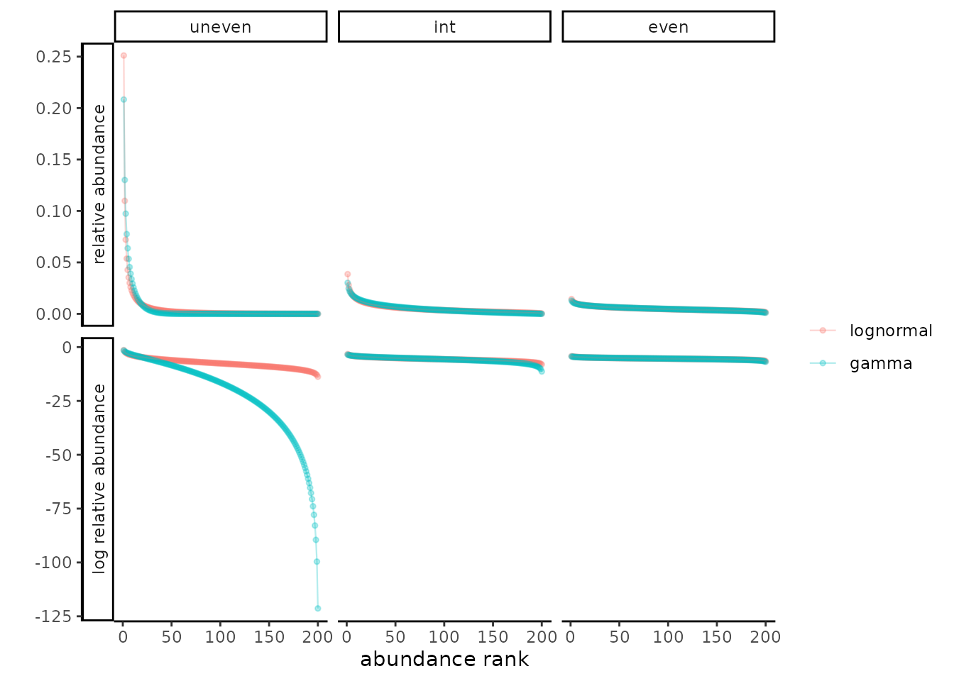
In the supplementary materials for (Roswell, Dushoff, and Winfree 2021), we demonstrate that the CI for diversity estimates based on the approach articulated in (Chao and Jost 2015) tend to be anti-conservative. The code and data for this are not exported by this package; the scripts to generate all relevant data and figures are available at [github link].